Boston Magazine
Boston Pops: A Conversation with Patrick Mitchell
This interview about our redesign of Boston Magazine appeared on the Society of Publication Designers website.
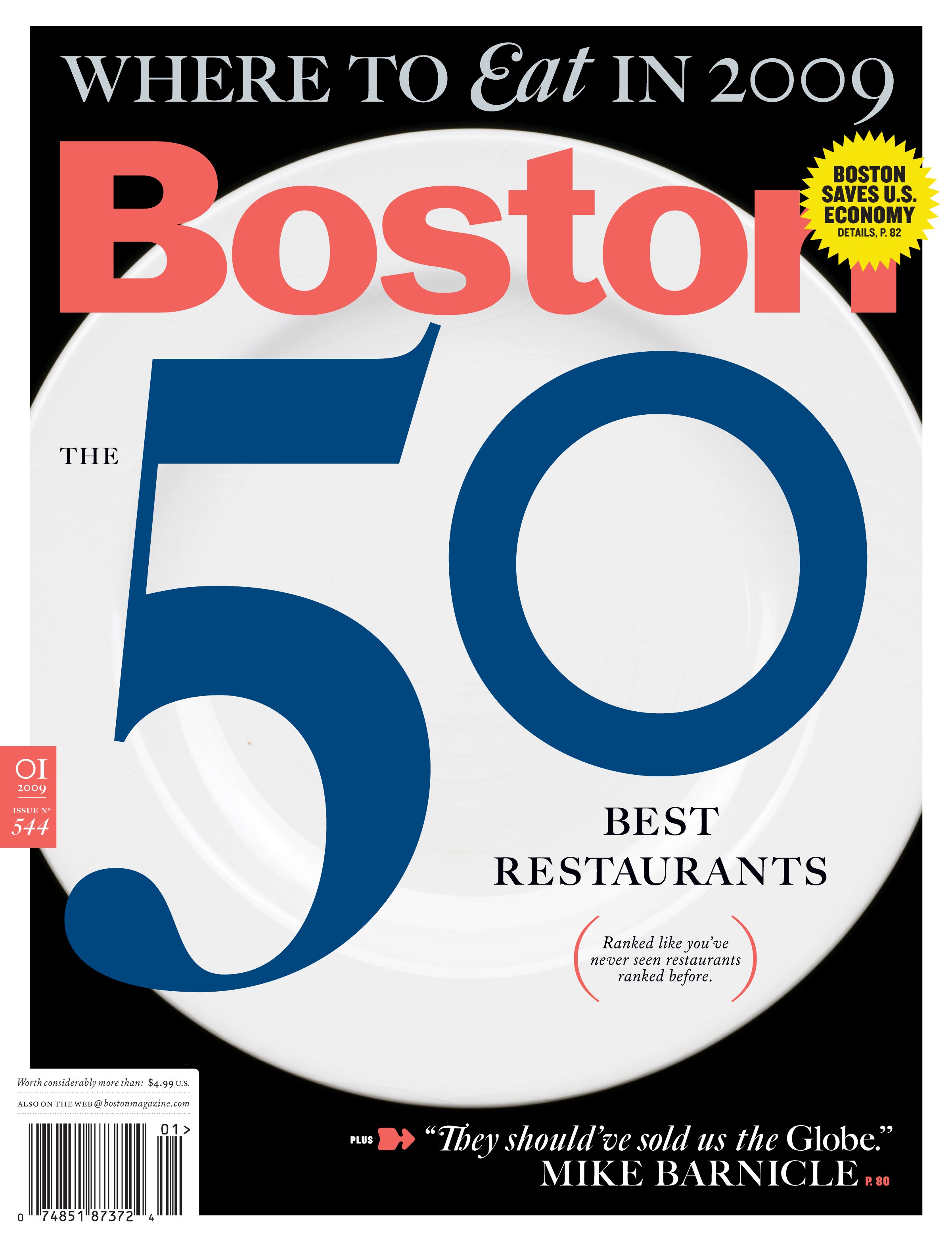
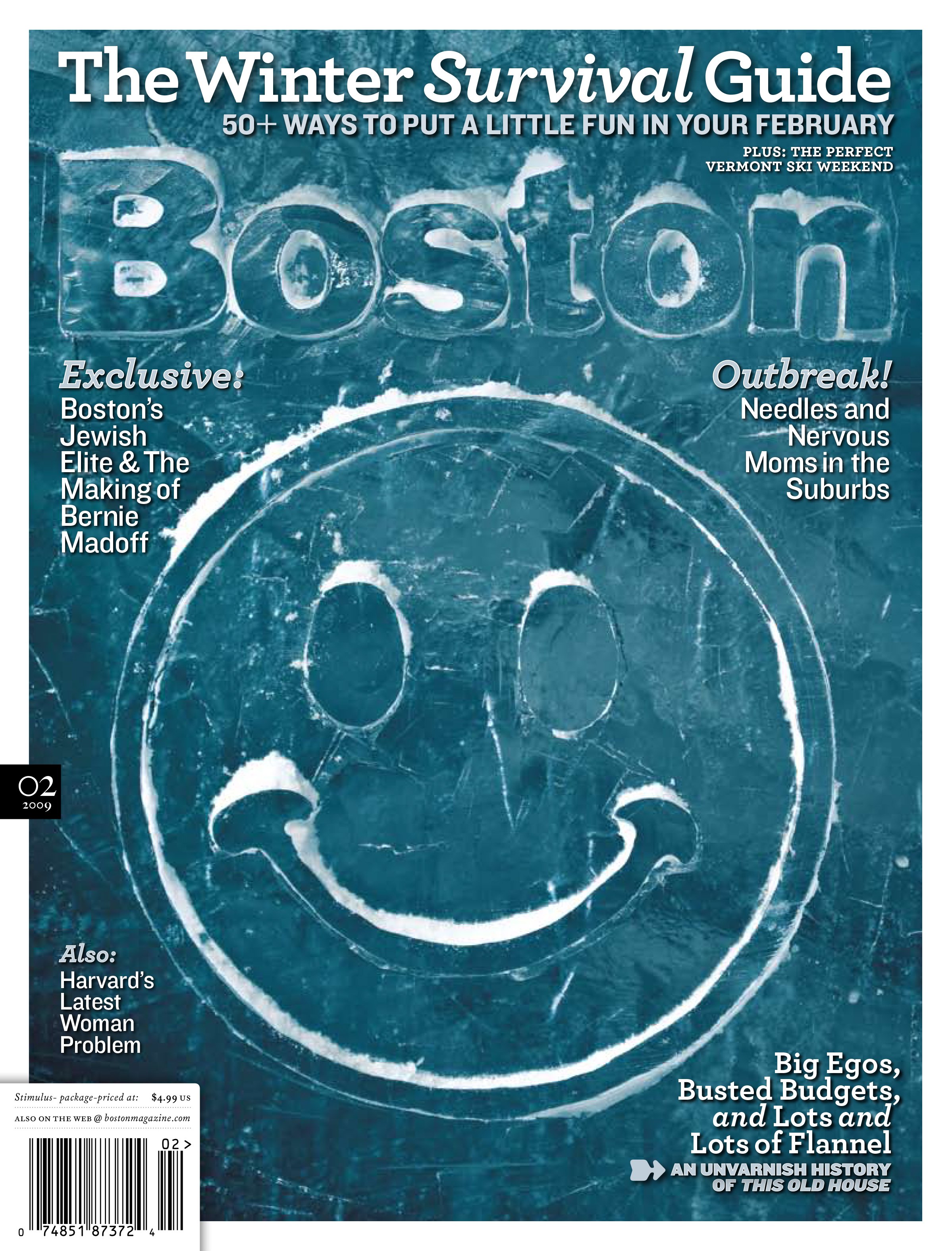
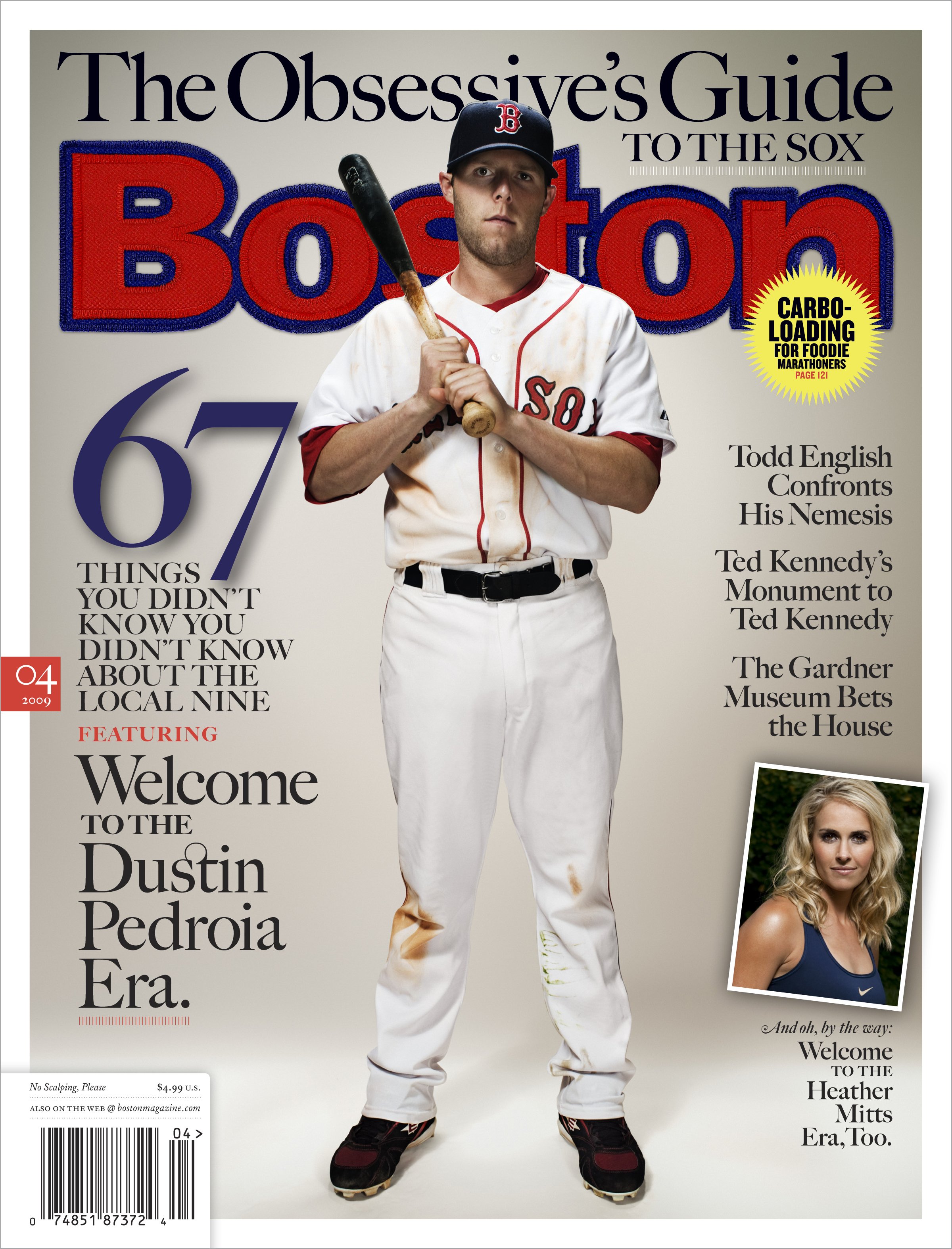
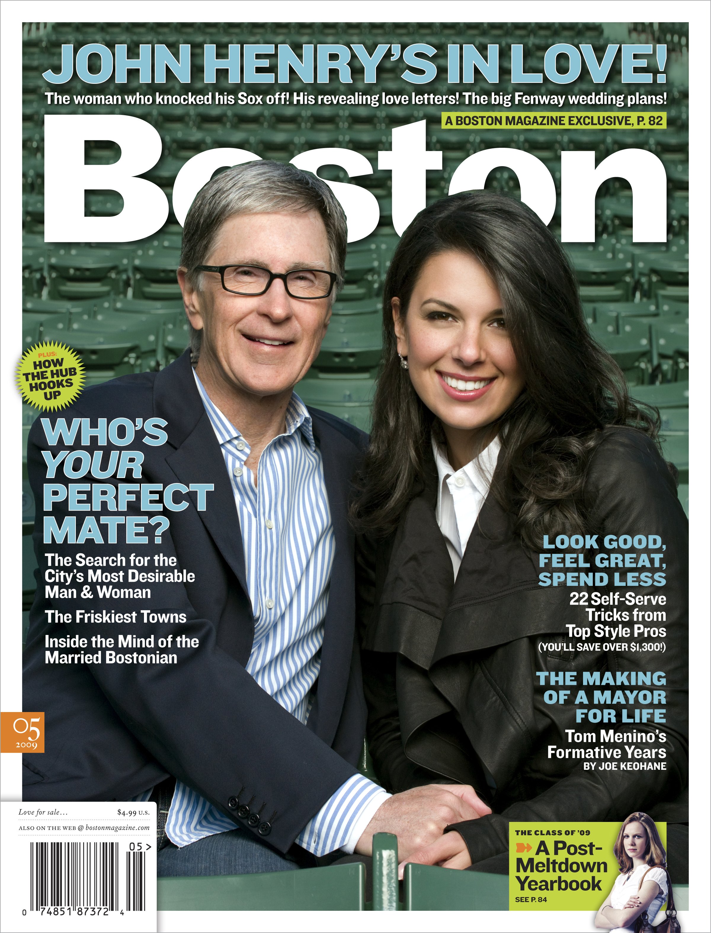
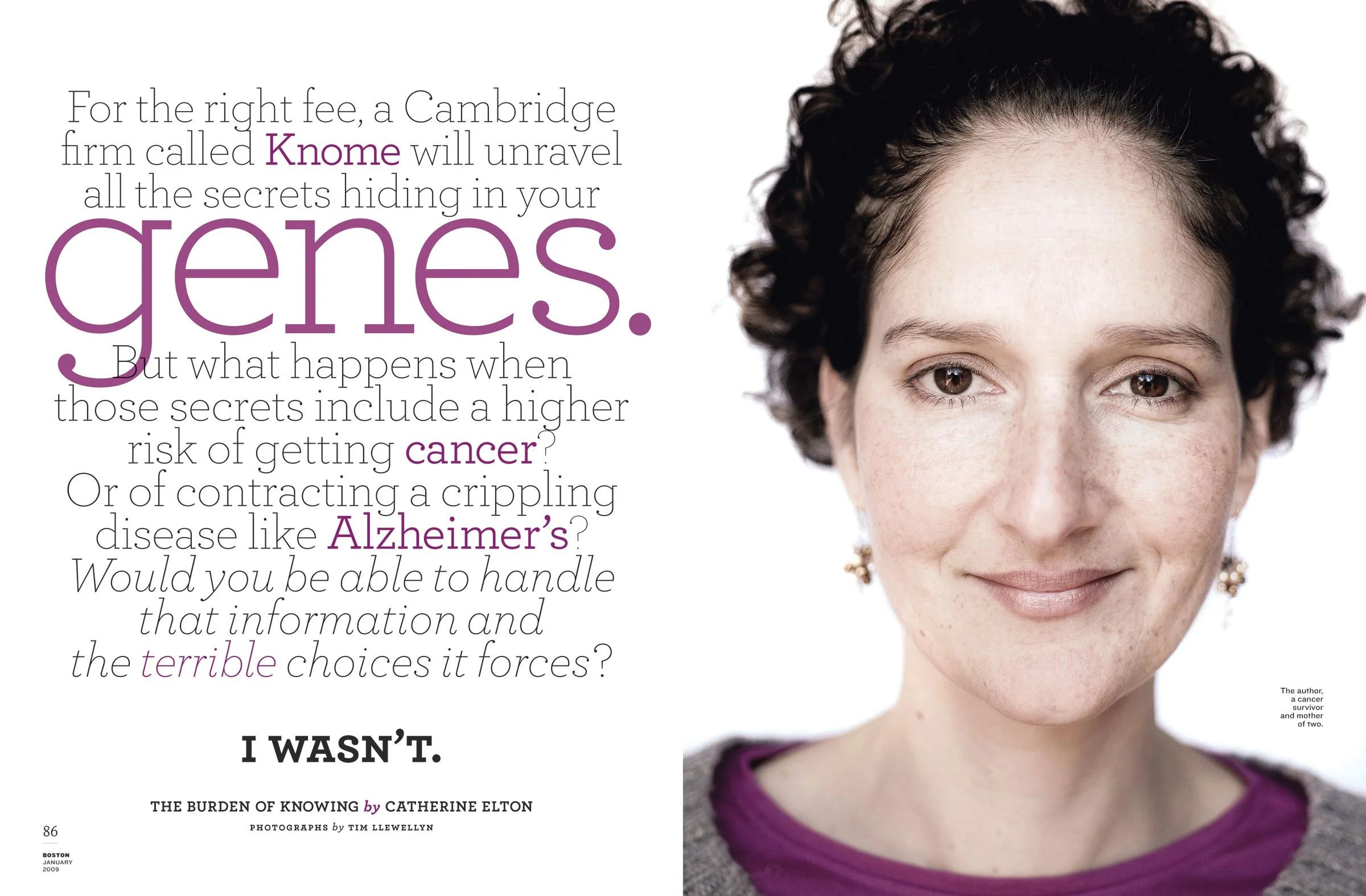
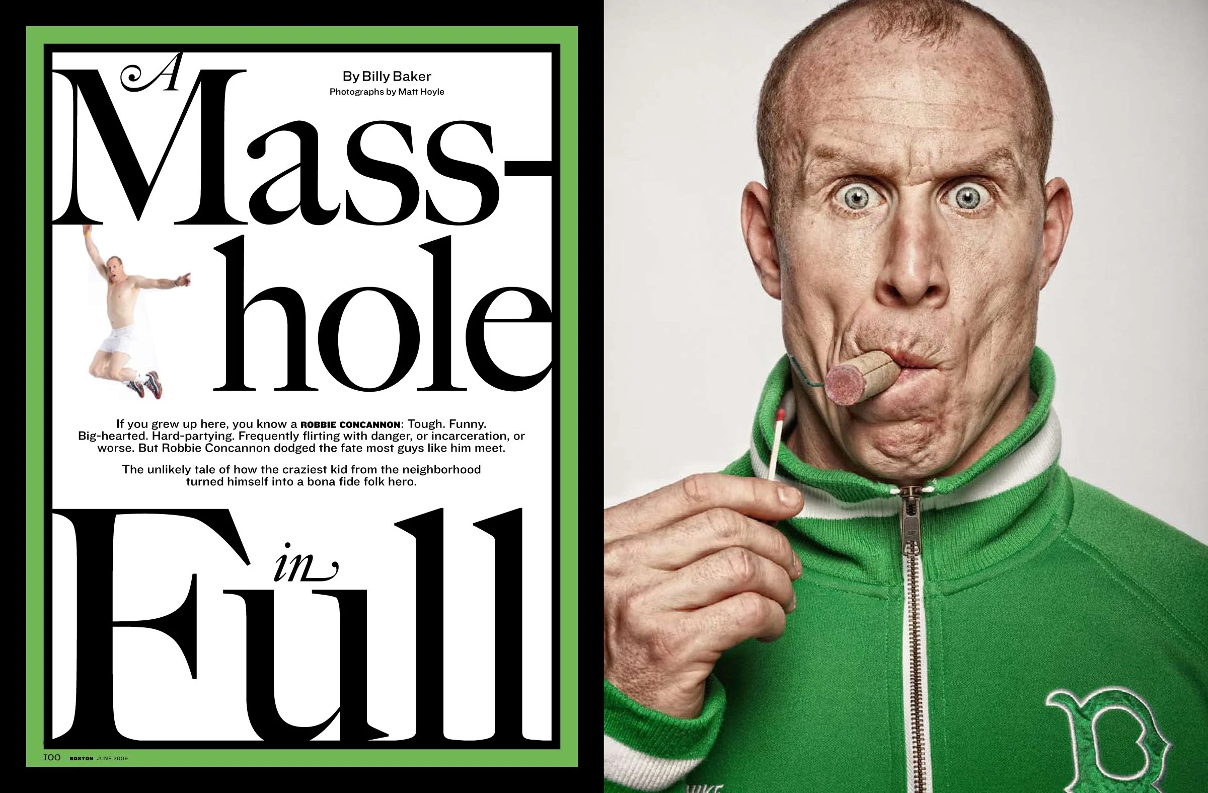
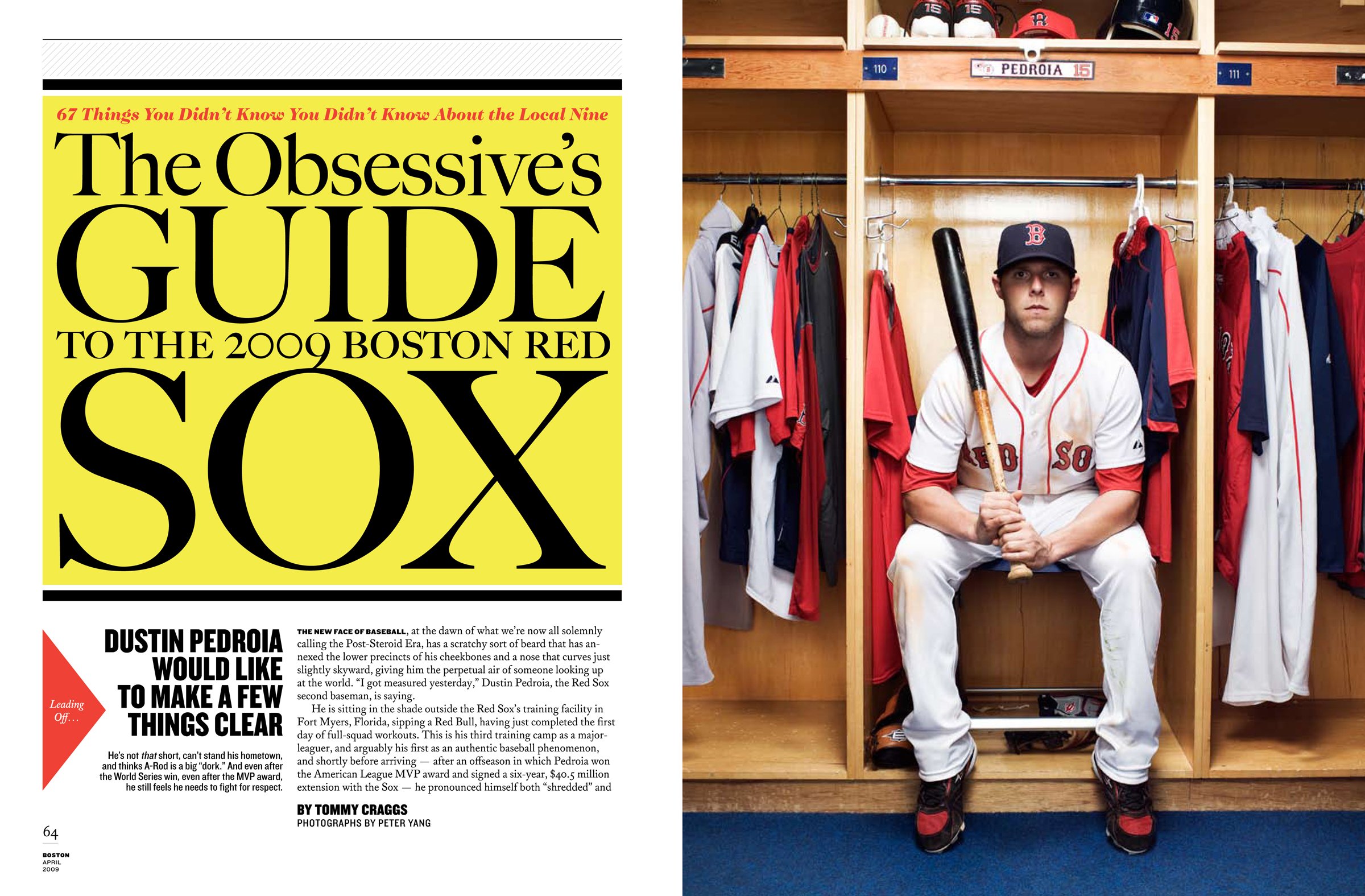
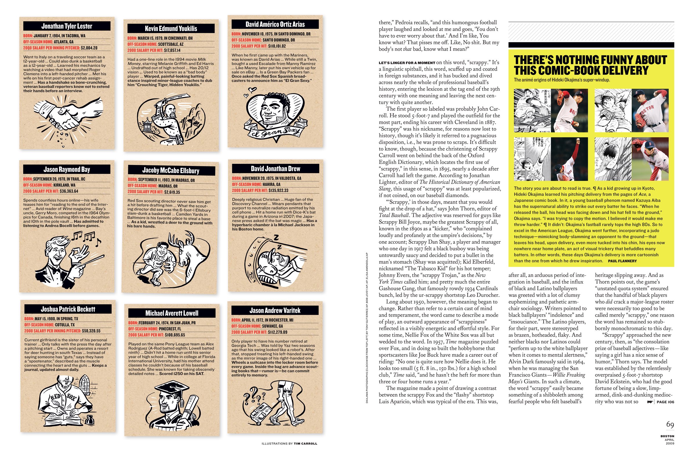
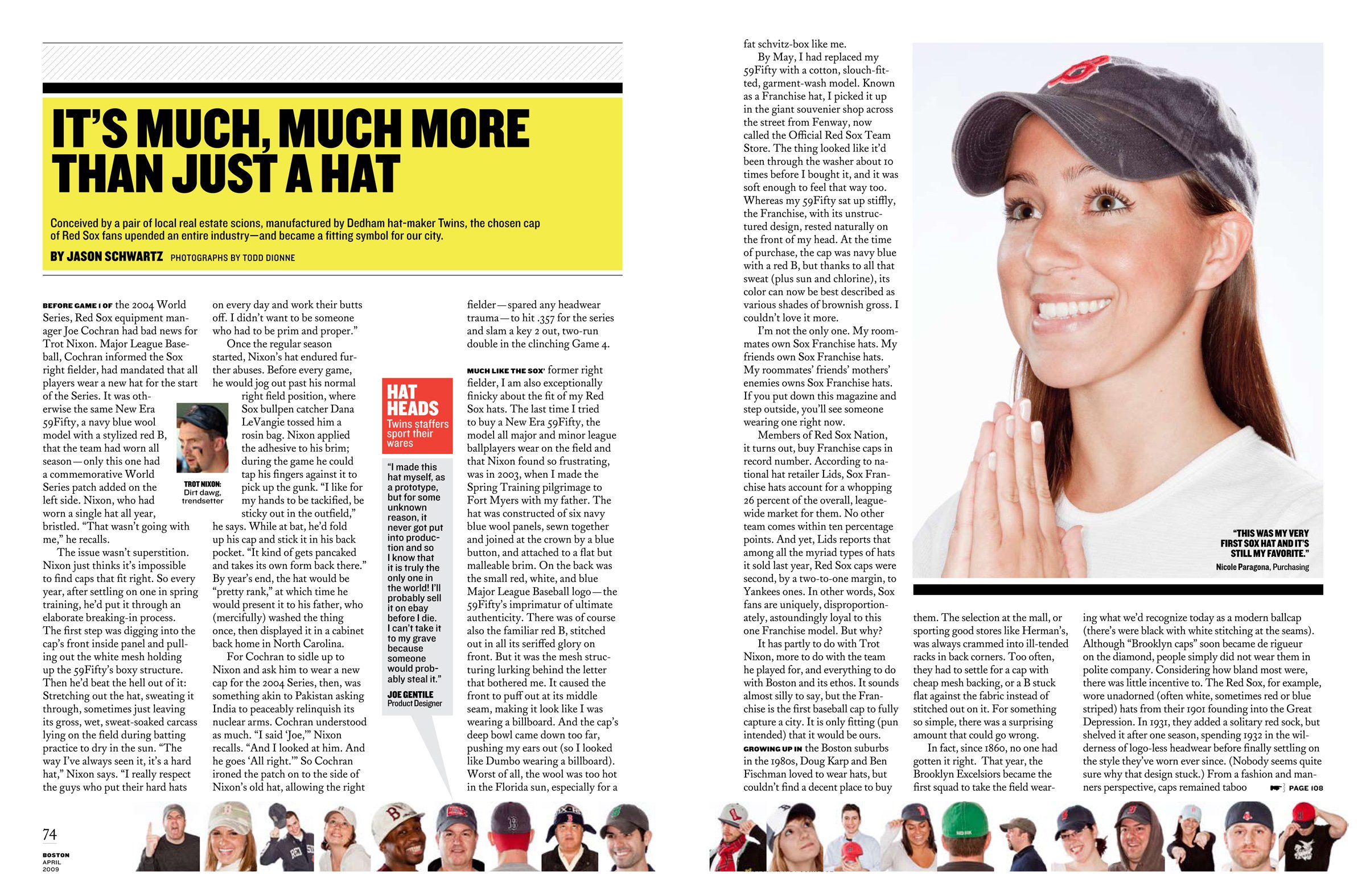
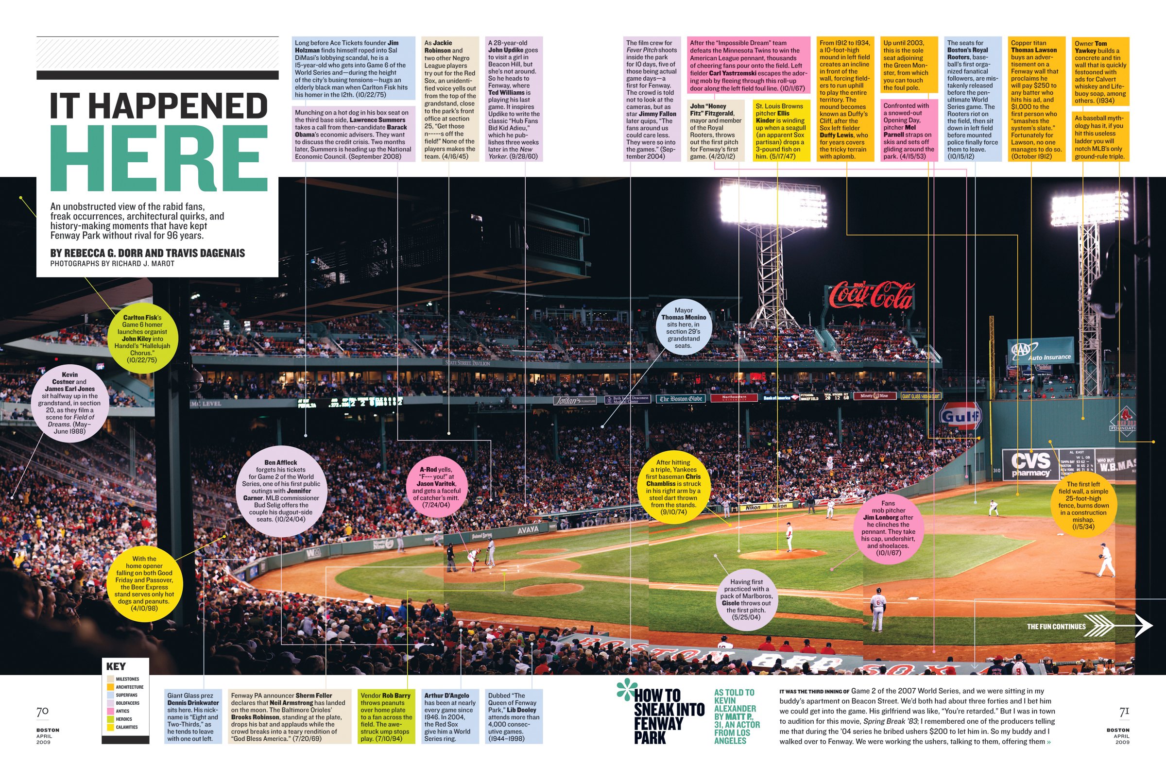
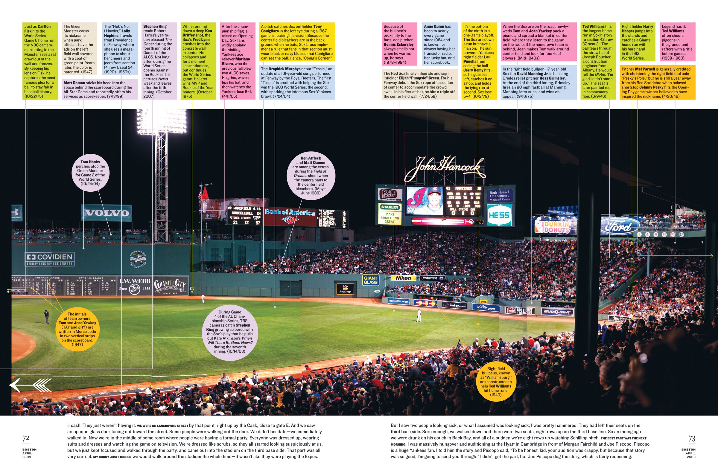
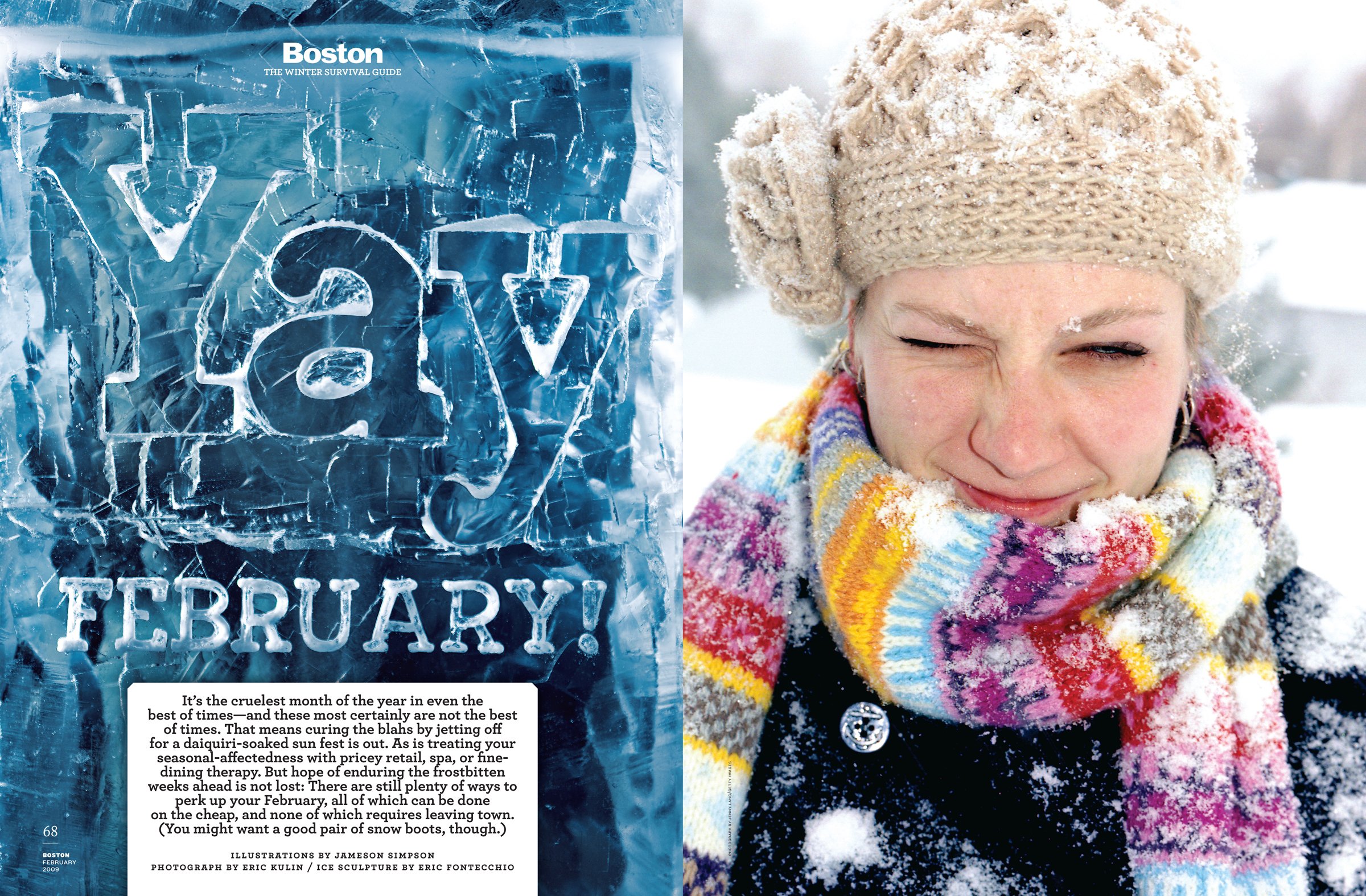
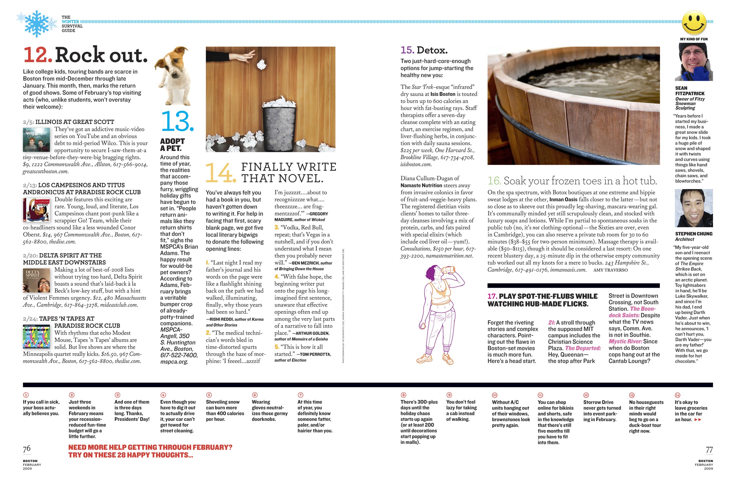
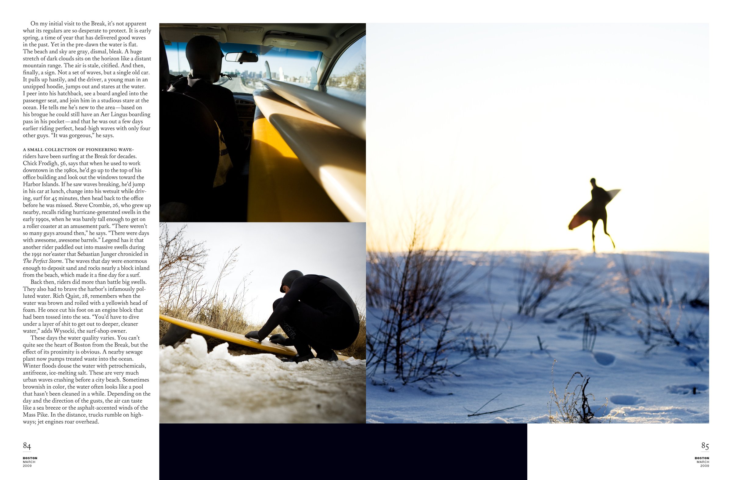
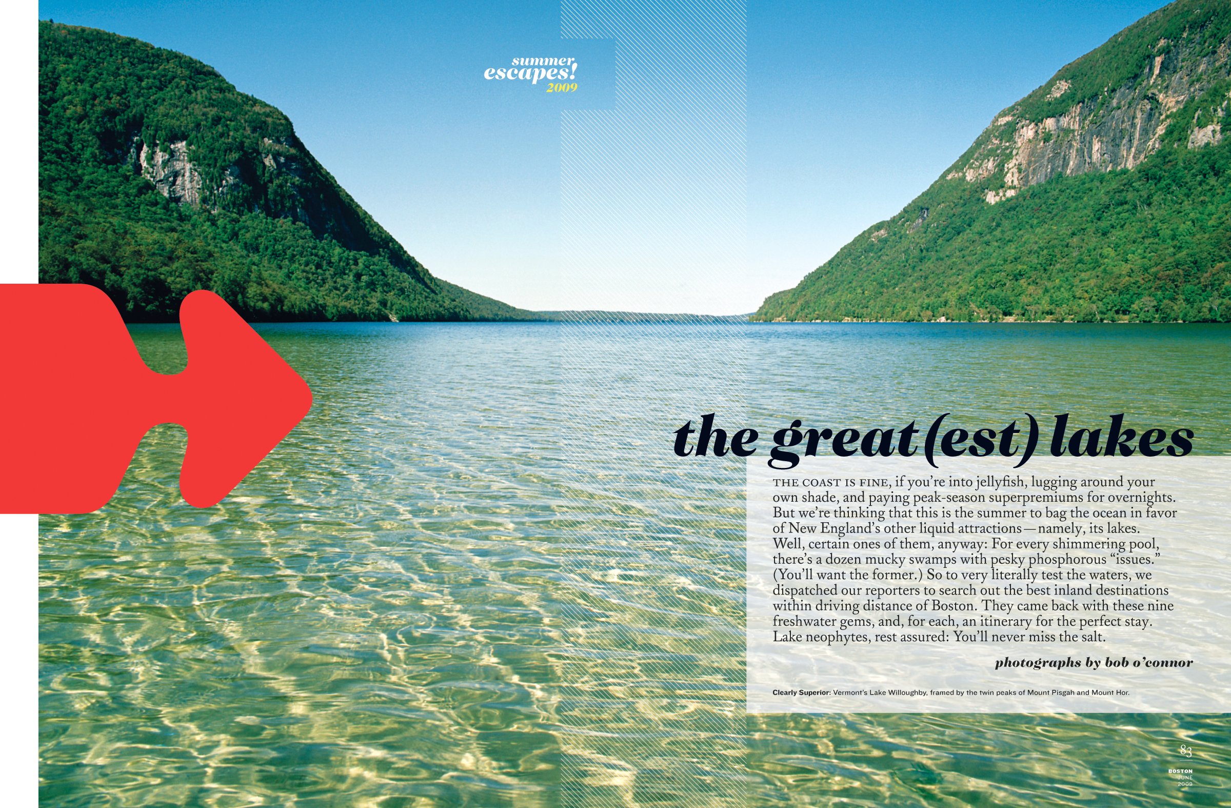
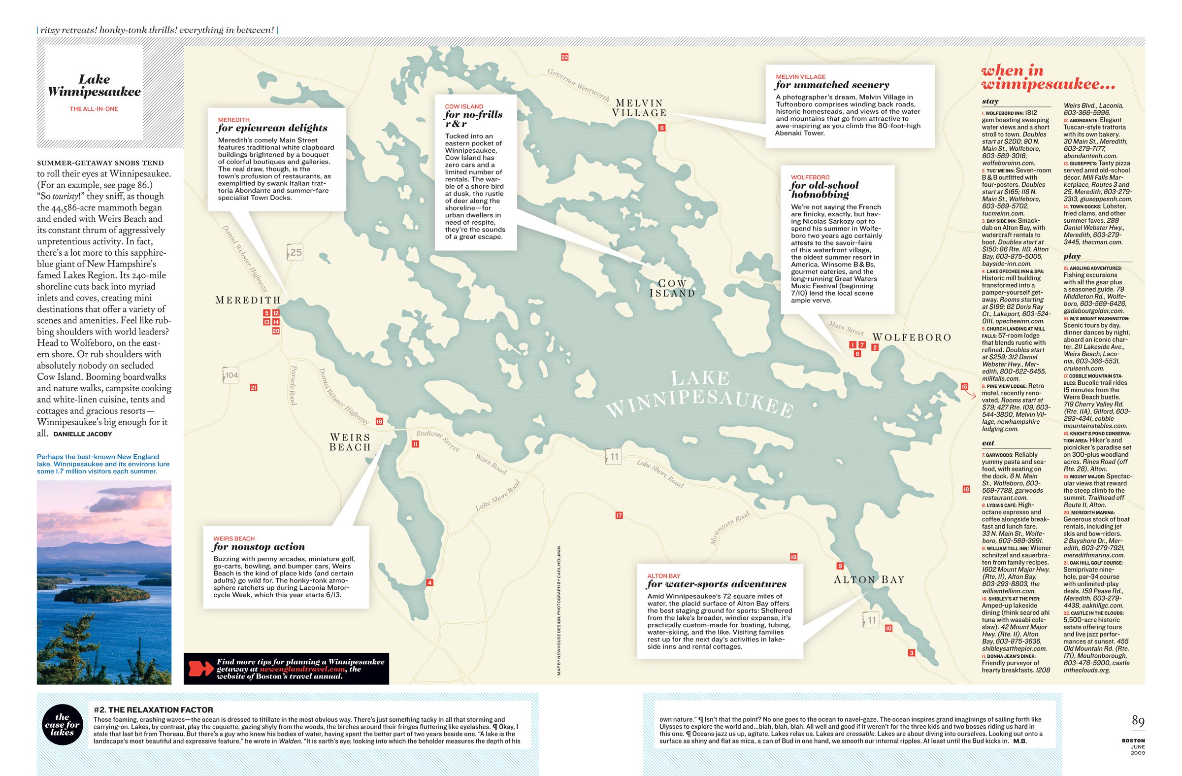
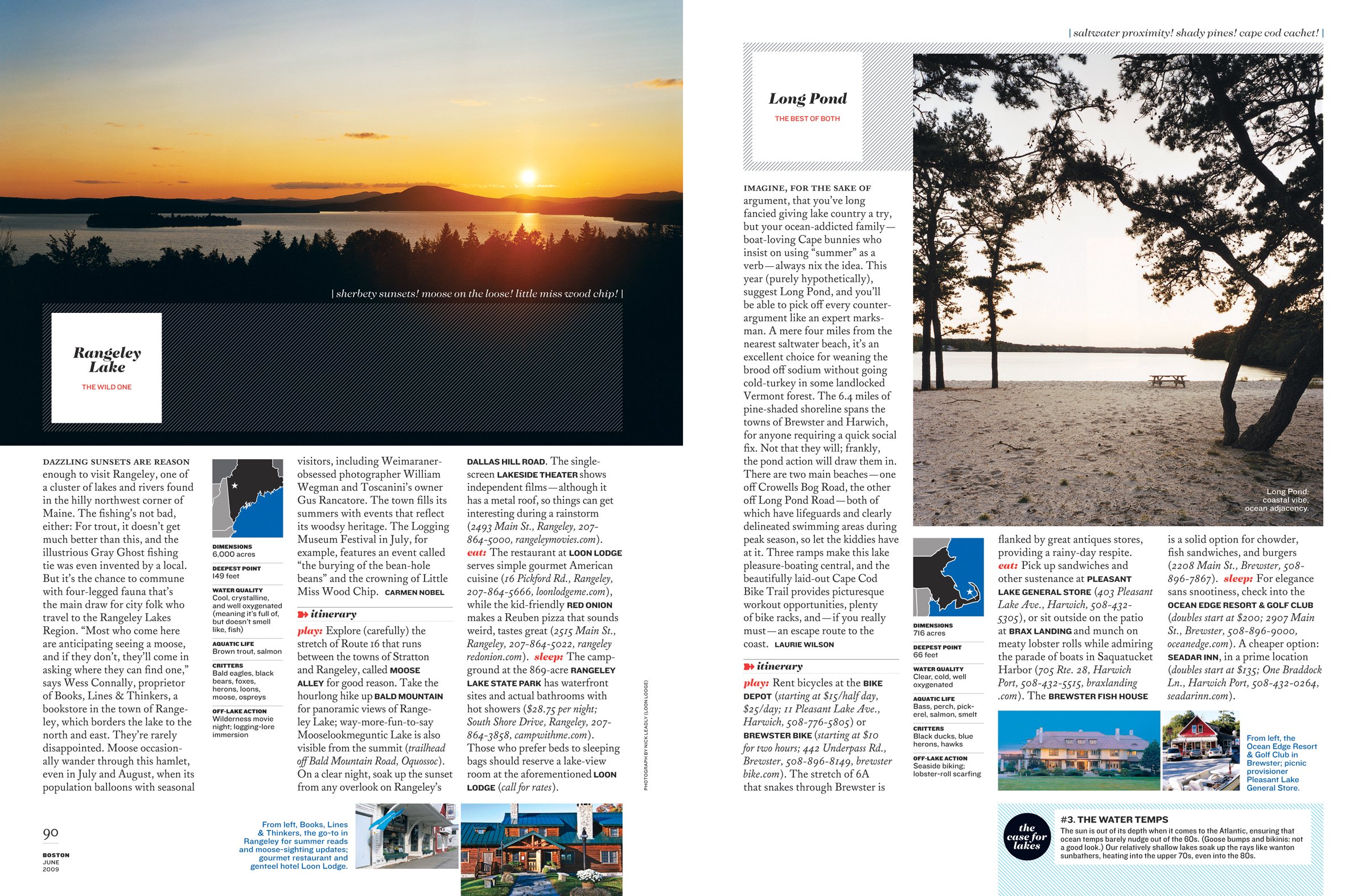
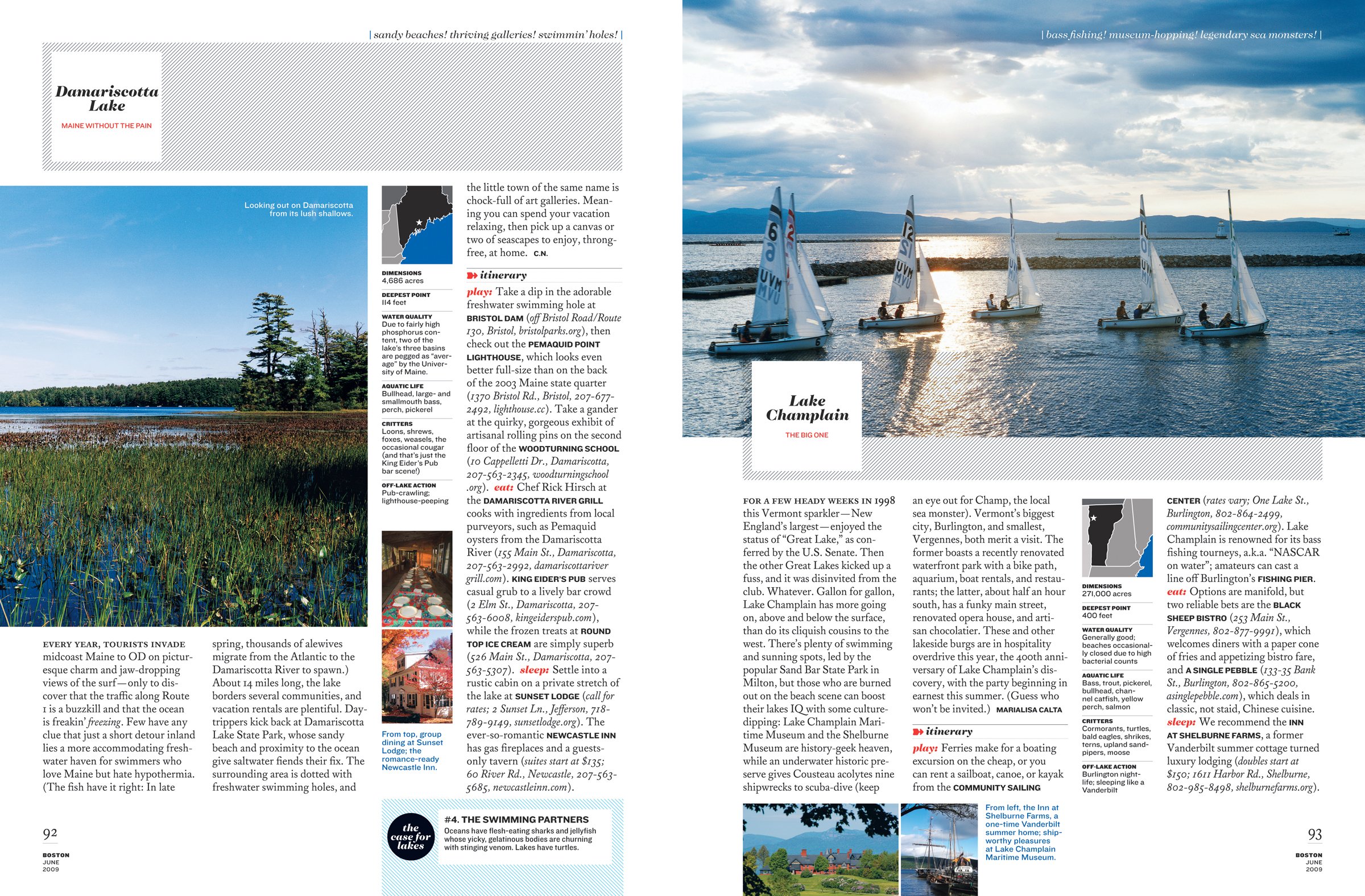
Last summer Patrick Mitchell set aside his design firm, PlutoMedia, to become Creative Director of Boston magazine. He spent the fall redesigning the nearly 40-year-old magazine. The redesigned book debuted in January 2009. When I asked about his inspiration he said, "Boston is an old city and its connection with history is palpable. We went back to the city's beginnings (the 1600s!) to find our typographic and design cues. We looked through all sorts of early published/printed materials to get in the right frame of mind, and then gradually worked our way forward."
Recently I had lunch with my good friend Patrick at Boston's Brasserie Jo to talk about the old days at Fast Company (where we first worked together) and about his new gig. Read on for the whole story...
Gretchen Smelter: So, what was the driving force behind the redesign of Bostonmagazine?
Patrick Mitchell: A little background: Prior to coming on staff here, Boston magazine was a client of my studio, PlutoMedia. We were designing their ancillary magazines (Boston Home, Boston Weddings, and New England Travel) for almost a year. We worked very closely with the in-house art department. As I spent more time looking at Boston magazine, I started to see its untapped potential. And then, BANG! The art department was gone! And there were openings not only for me, but for my PlutoMedia team, too. It was a sign from the gods. I weighed my options and decided I really missed working on staff (like back at Fast Company, remember?). So here I am.
The mission of the redesign was to make a magazine that reflected what a sophisticated, educated, cultured, urbane city Boston is. Over the last 10 years, it's actually become pretty cosmopolitan as well, and, like on Fifth Avenue, you're as likely to hear French, Italian, or Japanese being spoken on Newbury Street as English.
GS: Why did you decide to completely change the architecture of the FOB? Including the name and individual sections?
PM: City and regional magazines are an incestuous bunch. There are the truly great ones (Texas Monthly, New York), and then there are the rest. When one has success at something, the others quickly follow. And because we're all doing a lot of the same stories, the overall design (Boston included) can tend to be pretty homogenous. There's definitely a "city magazine" look.
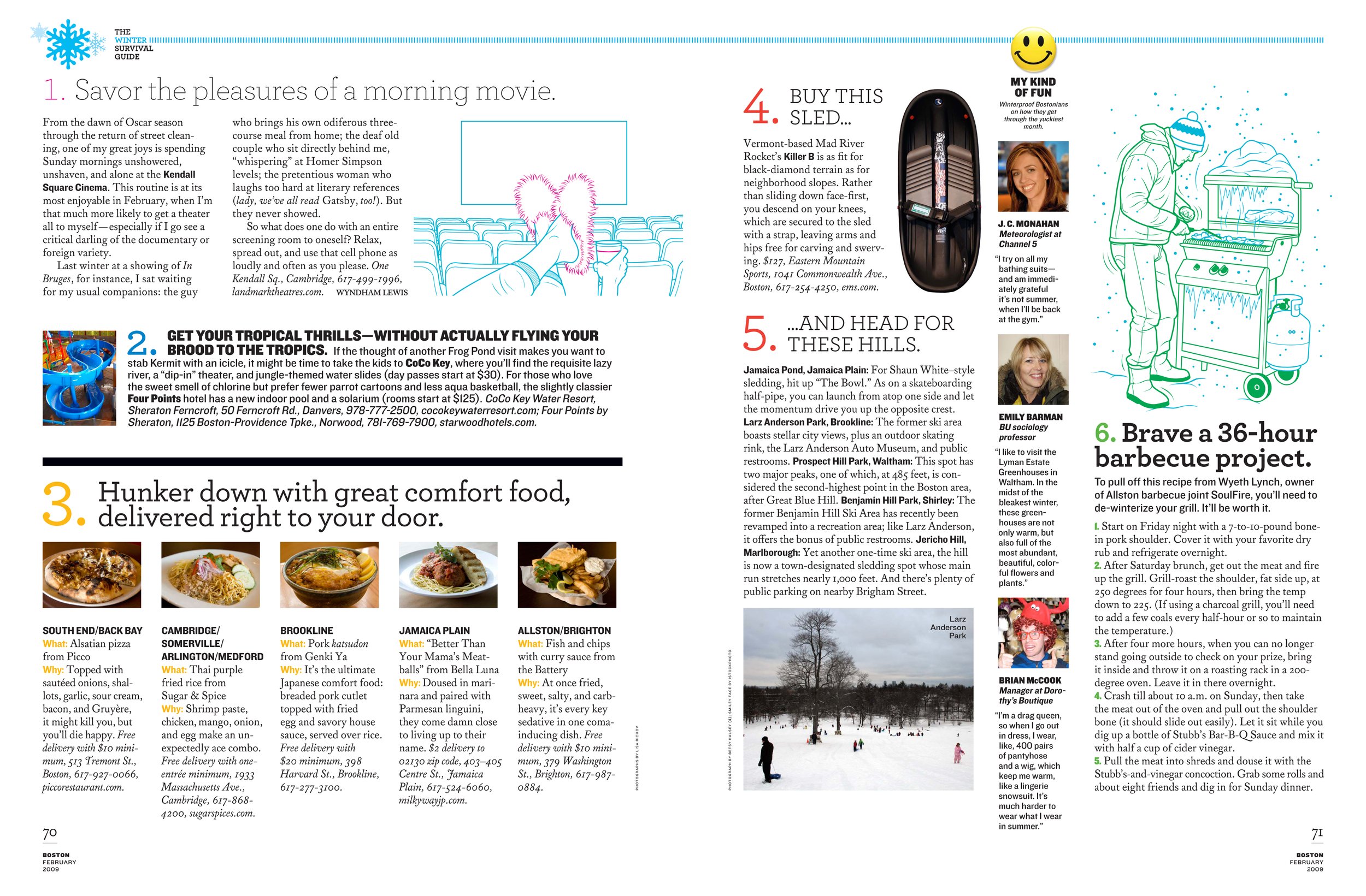
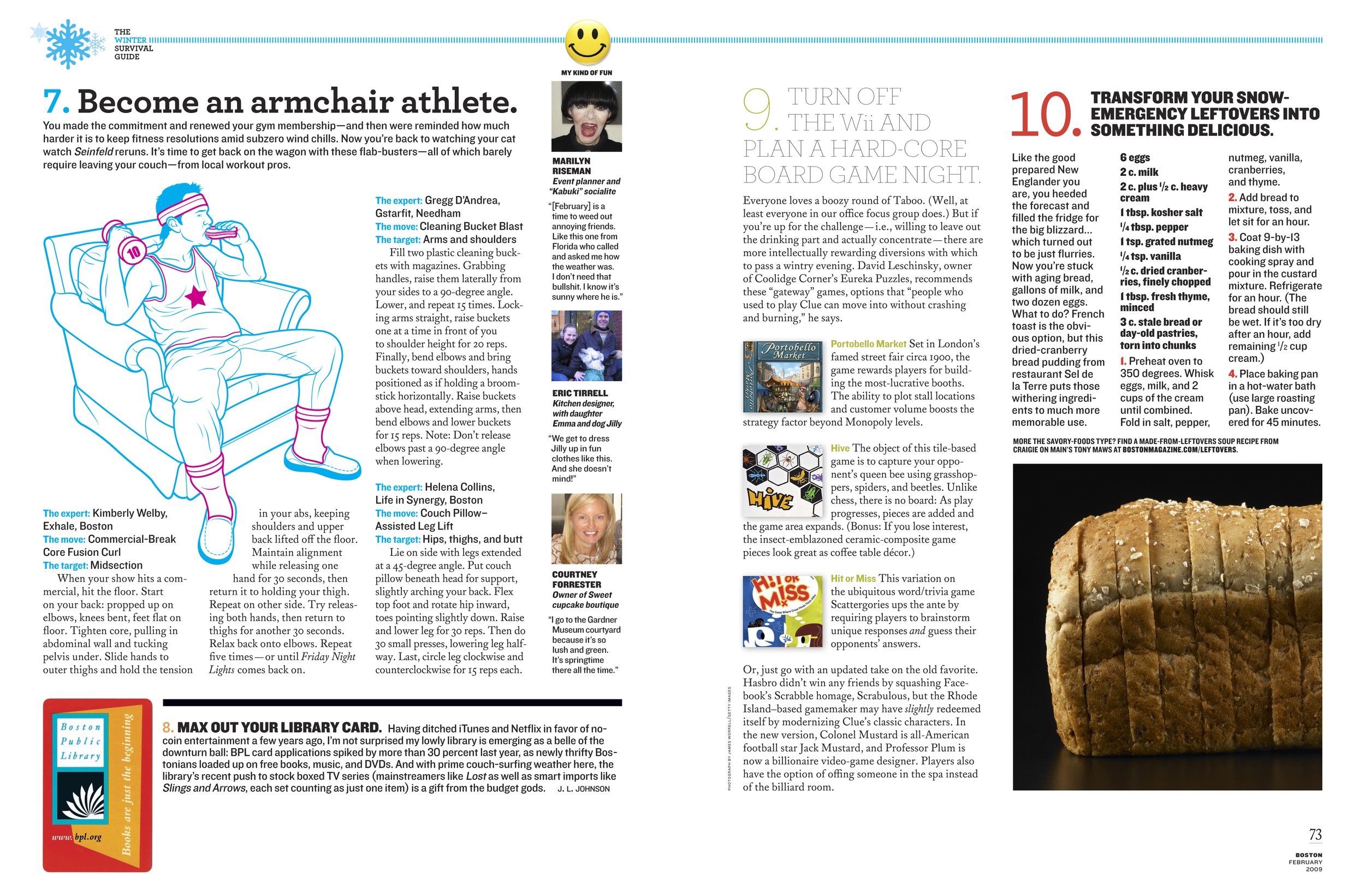
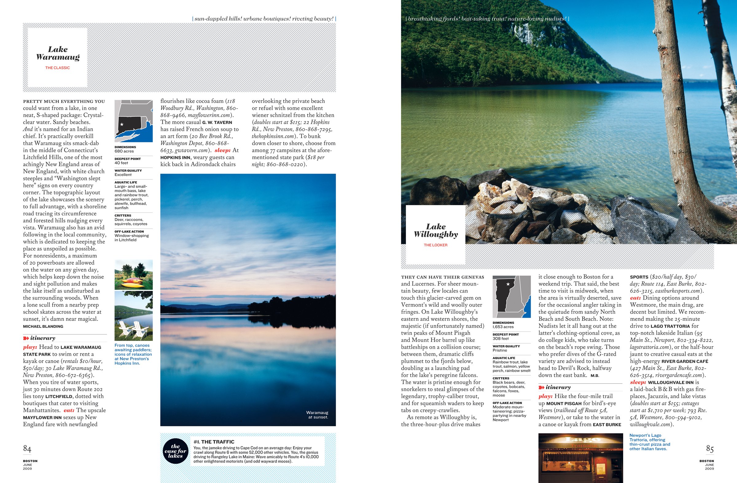
Our FOBs were called "City Style" and "City Journal" which at some point were probably unique, but aren't anymore, and don't really convey much of a Boston-specific personality. So we came up with 3 FOBS that cover the wide range of topics that city and regionals cover. The first, "Forecast," is a calendar- and event-driven section. It's followed by "Connoisseur" where we do fashion, shopping, food, travel, culture, and design. The third FOB is "Examiner," which is our news section.
GS: Having the distinct honor of working with you in the past, I've known you to be a devout minimalist -- especially with fonts. It seems as though you ignored that in this redesign. Why?
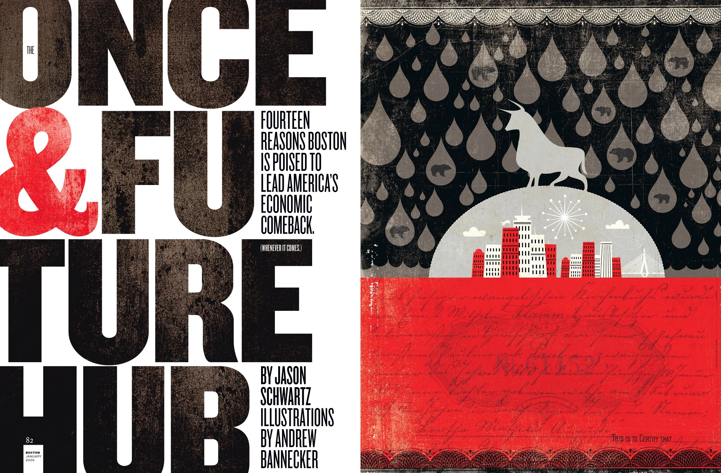
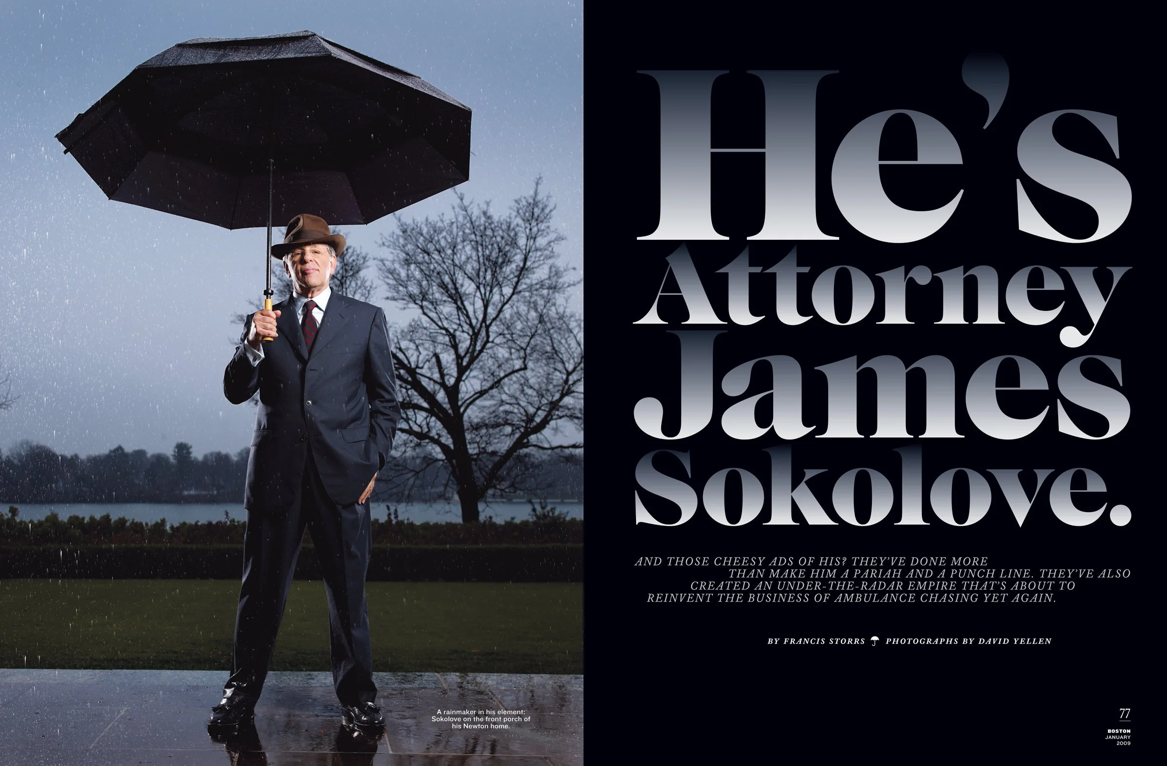
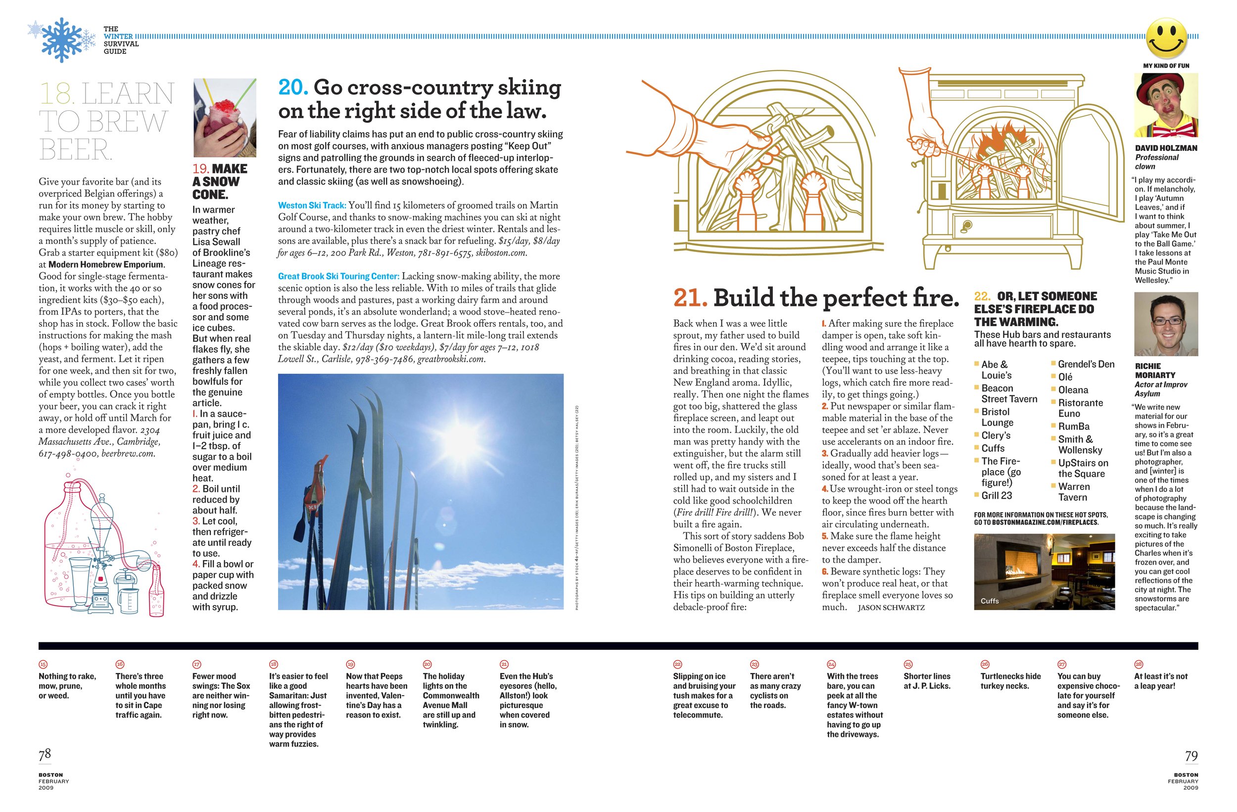
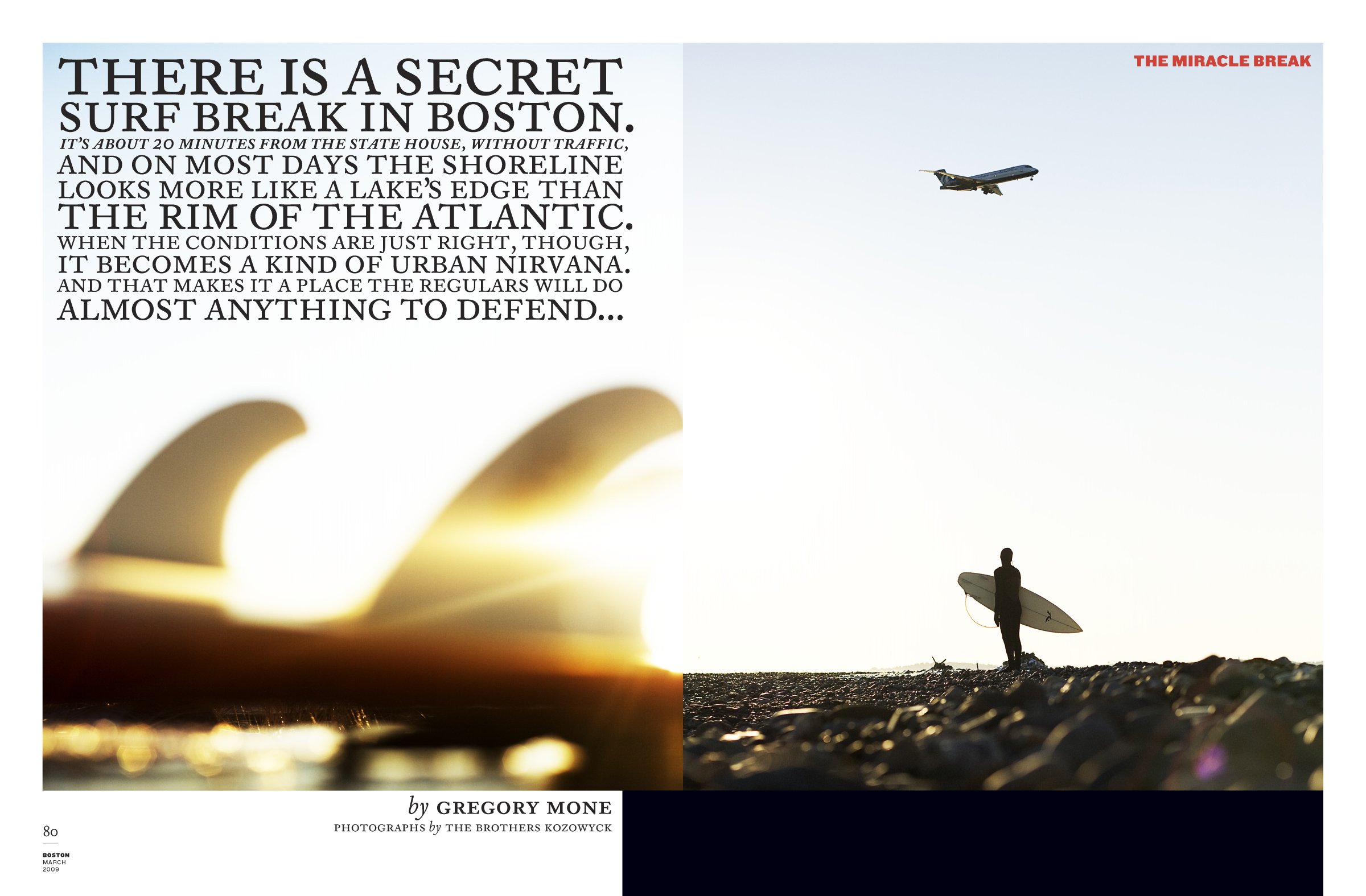
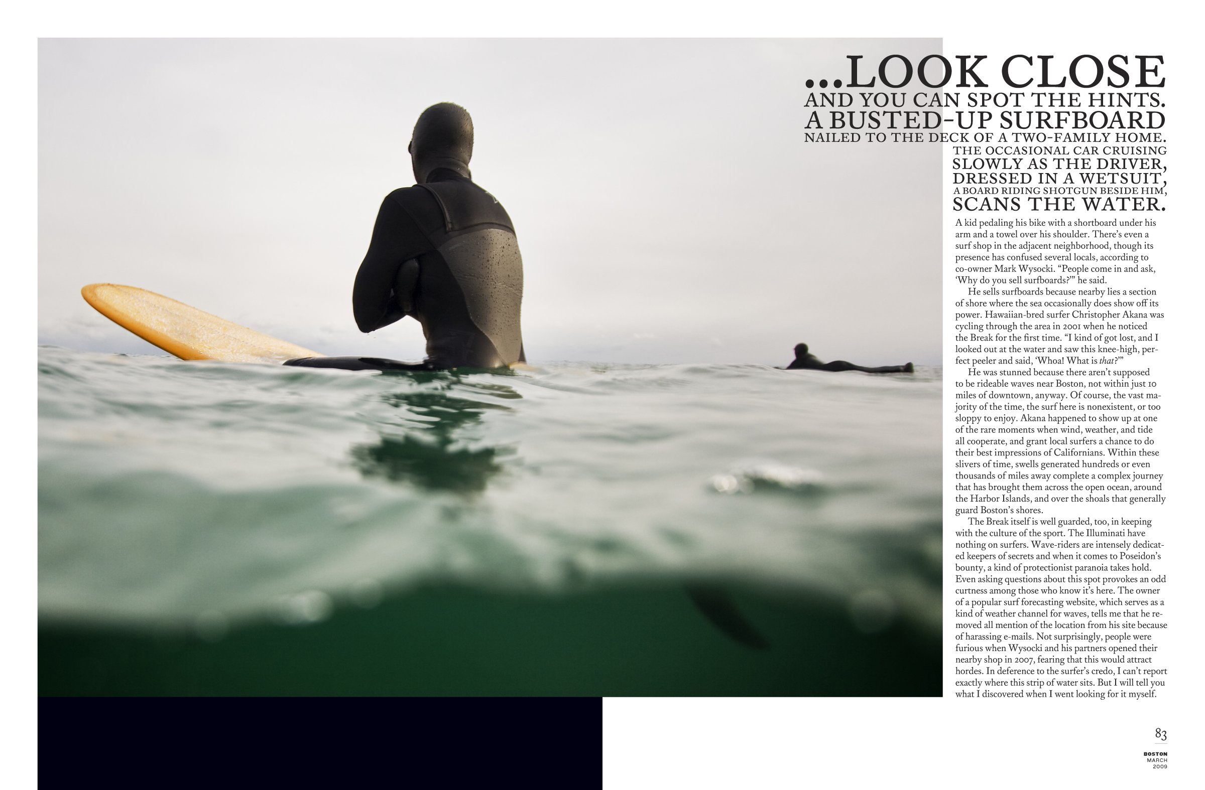
PM: I do believe in simplicity, but I also believe that each job is unique. The new design of Boston is meant to reflect the city's rich history, its collective IQ, and its European roots. It didn't hurt that HBO's John Adams miniseries came out right as I was working on it. When you're researching Boston's publishing history, you have to go back to the 1700s — which is how we arrived at Caslon. Caslon was exported to the Colonies by the British, and it's in the DNA of our country. The Declaration of Independence — the publicly-circulated version -- was printed in Caslon. As I researched publications of the era (especially Poor Richard's Almanac), this sense of "typishness" kept recurring, and it was so labored and overdone — and I really liked it. We needed a classic serif font that had plenty of ligatures, alternates, and a swash italic. We worked with David Berlow at Boston's Font Bureau to tweak Matthew Carter's Big Caslon, which is our primary display type. In addition, they were kind enough to share their as-yet-unreleased Williams Caslon Text for our body copy. We're also using Archer and Knockout (Hoefler & Frere Jones), and United (House Industries). It's a big-ass font stew.
GS: I love how the folios change from the FOB to the well (God is in the details!). Where'd that come from?
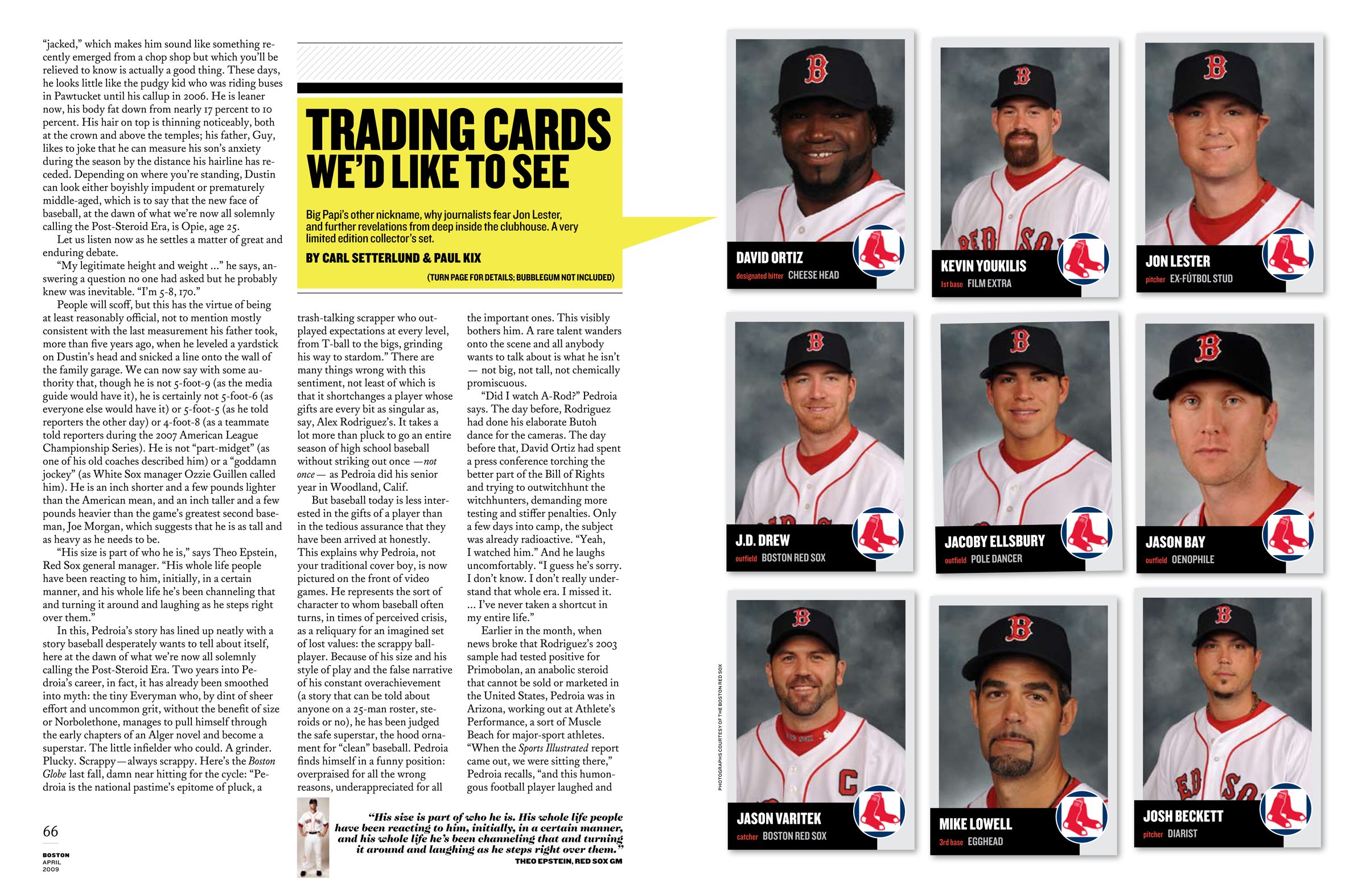
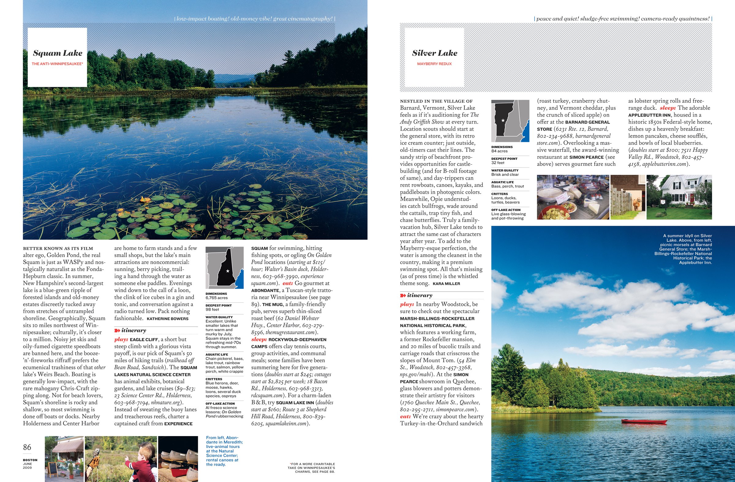
PM: Folios have become a little detail that I sweat WAY too much. It's a personal challenge for me to never do two the same way. As for Boston, there was a practical reason for the two folios. As you've noted, one of our inherent obstacles is the number of fractional ads we have to deal with. They're rampant in most city magazines. For those pages, our stacked folio wouldn't work, so rather than scrap it all together, we just came up with an alternative for those pages. It's funny how something as small as a folio can affect the overall look and feel. I was lucky that I could convince everyone that forcing the magazine's URL into the folio was silly — it was nice to get it out of there. I think our slightly over-wrought folio is unique and appropriately fussy for this magazine.
GS: How DID you deal with all those skinny columns with fractional ads in the middle of your great design? Ugh!
PM: 'Ugh' is right. But it's a reality we had to deal with. As our owner says, they are the 'bread and butter' of city magazines. We tried to address them head on. They used to be great for eating up text in long stories, but our stories have gotten much shorter. So, for example, we created content called "The Skinny" (get it?), especially for those spaces.
GS: Tell me your visual thought process behind the Examiner.
PM: Years ago I bought an issue of McSweeney's that was several 'booklets' bound into one big book, held together by a fat rubber band. I've kept it for years, waiting for an opportunity to do something like it. As we planned the redesign, it occurred to me that a city magazine really has to be several magazines in one: news magazine, fashion magazine, calendar, restaurant guide, shopping guide, human interest magazine, and newspaper. We created the new FOBs with that in mind — that they were each a magazine within a magazine. And the Examiner is our “newspaper.” We even print a newsprint color behind the pages — the ads, too.
GS: Is it a challenge to hire photographers in the Boston area or do you end up using NYC people?
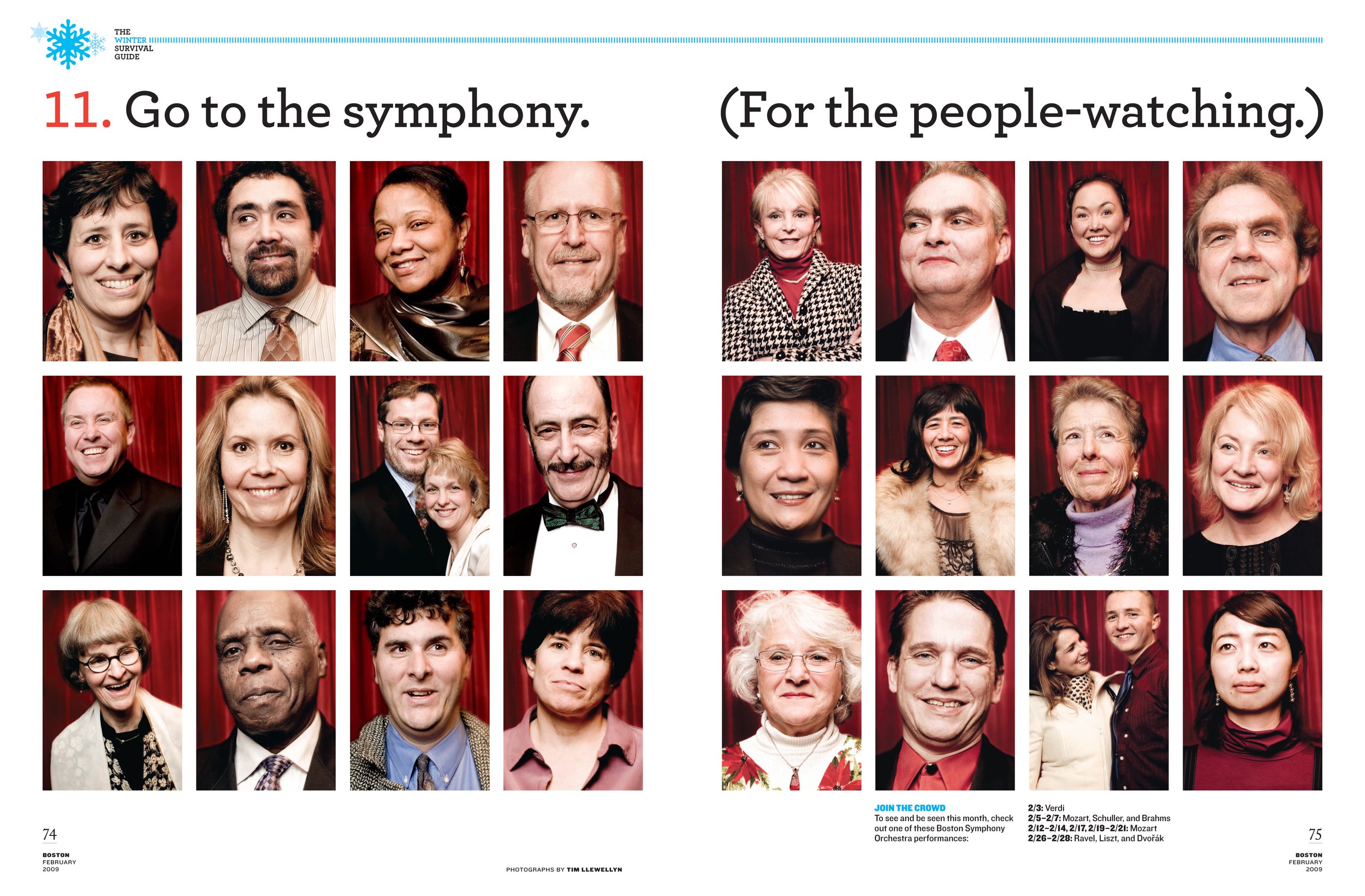
PM: In this economy, it is a real budget challenge to bring in outside photographers. But there are very talented photographers here. They're just not completely fluent in magazine photography, which, as you know, is a unique pursuit. For a photographer to survive in Boston, they have to really be jacks-of-all-trades: still life, portrait, landscape, etc. But it's hard to be really great at one discipline if you have to shoot them all. So it requires more direction and input on our end to get the results we need. But so far, so good. That said, we have had several NYC photographers shoot for us since I've been here. If they like what you're doing, they don't mind making the extra effort to get here.
GS: Did you have a lot of creative freedom in this redesign or did your editor have a bunch of input?
PM: James Burnett, the editor, and I worked very closely together on the redesign. He had plenty of influence on the look and feel, and I contributed a bunch to the editorial. We made a good team. We really gutted the old magazine to create something completely new, to try and break free from the city-magazine routine.
GS: Tell me about your color palette. It seems as though you went crazy with typefaces and completely monochromatic with your colors -- a lot of red, white, black and yeller going on. What up?
PM: I did not know there were other colors available [laughs].
GS: How did the edit have to evolve with your redesign?
PM: James had been thinking about this for a long time — before I even got here. So he was ready. And we changed everything. I’d say content-wise, about 15-20 percent of the old stuff still exists.
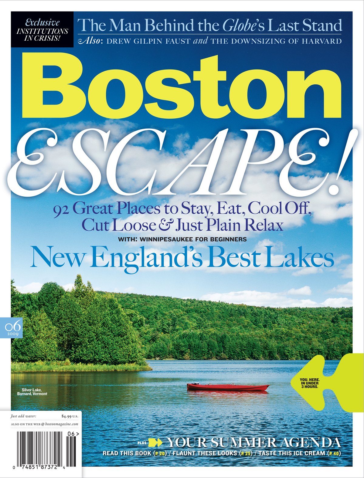
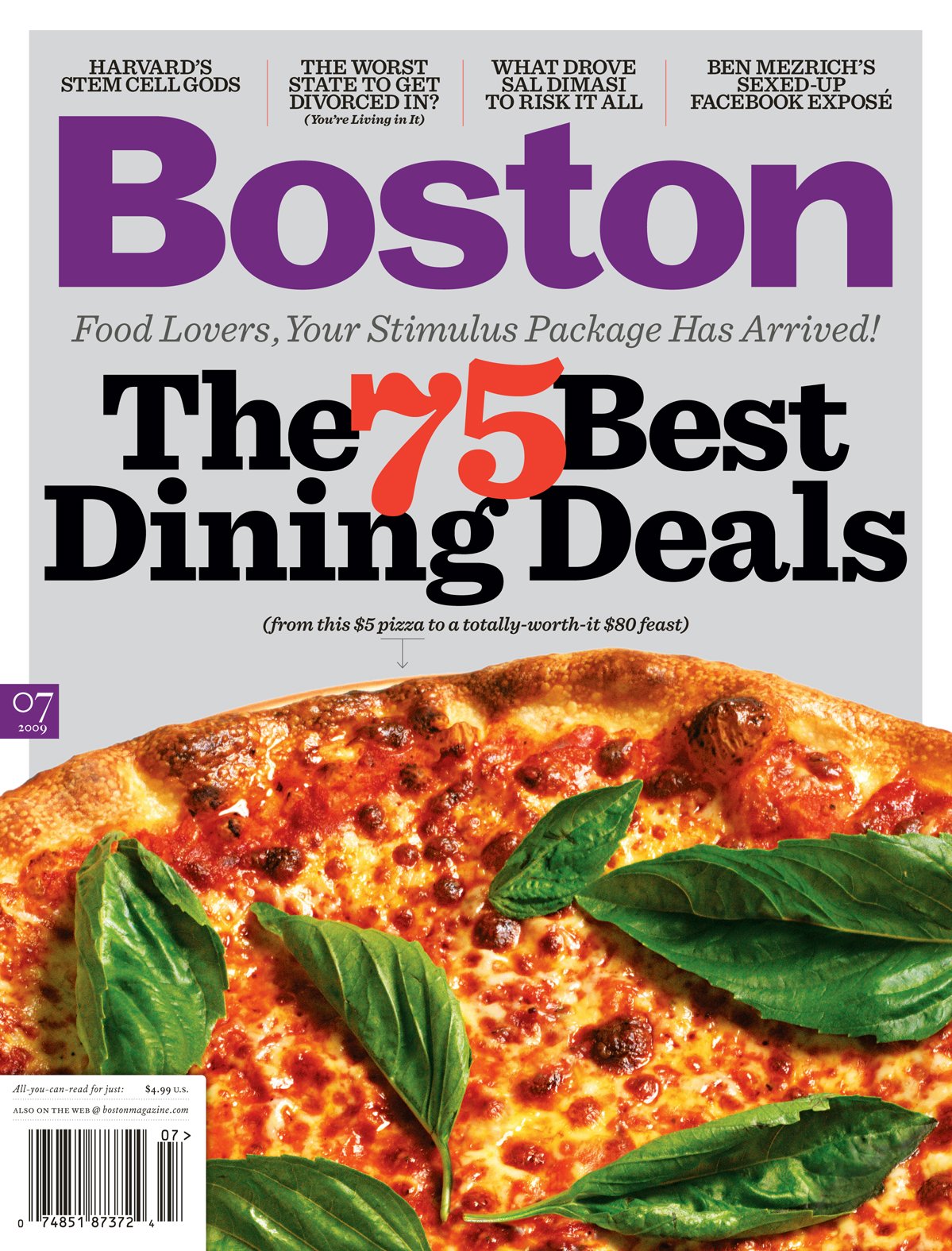
GS: What's your plan for the covers? Will they be a mix of typographic and photography?
PM: I don't have a plan. It's hard not to look at New York magazine's covers and just say, 'let's do that!' But they have a distinct advantage in being a weekly. With 50 issues a year, they can experiment more than you can with a monthly. What that means for our covers, I don't know. I'm taking them one at a time.
GS: What next?
PM: You know me, dude. I'm already working on the next redesign! But seriously, now that everything's in place, I'll start noodling with it. Who knows, it might look completely different in a few months.

